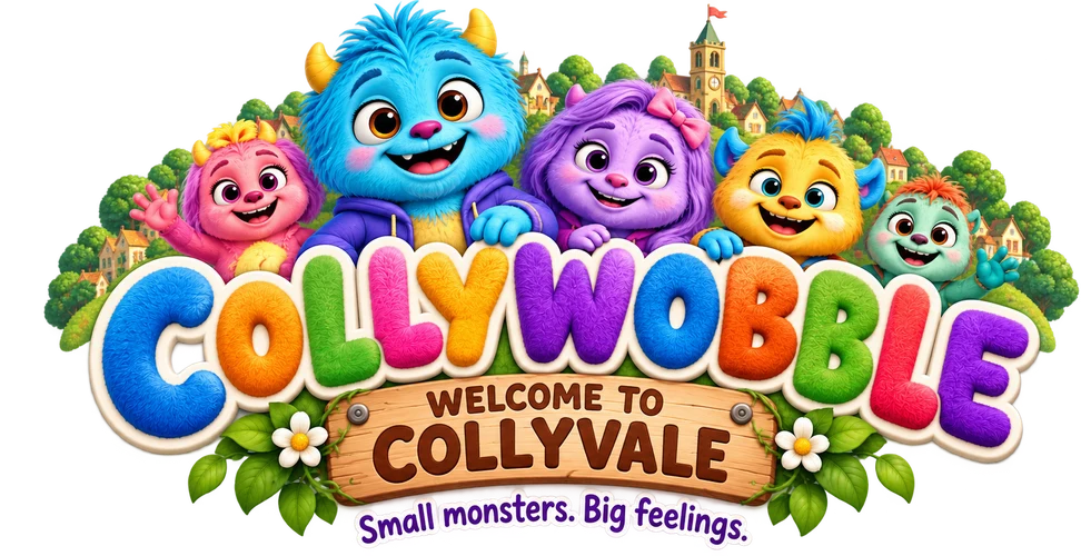
Everything that makes Collywobble feel like Collywobble.
Mission, voice, colour, type and character rules — the full identity system behind the family.
Why we're here
To give every small person a friendly way to name their big feelings — and a fuzzy family who feels them too.
What we stand for
Warmth, honesty about feelings, togetherness, playfulness, and gentle courage — trying something new even with wobbly knees.
Who we'd be at a party
The warm, slightly clumsy friend who asks how you're really doing — then makes you laugh before you've even answered.
Tone of voice
Collywobble talks like a warm adult crouching down to a child's eye level — never above them, never baby-talking either.
Plain and warm. Short sentences. Real words. "That flutter in your tummy is called a wobble."
Sensory and present-tense. Describe what's happening now — the smell of pancakes, the crunch of leaves — rather than abstract ideas.
Feelings-first, fixes-second. Name the feeling before offering a solution — or don't offer one at all.
Never scolds or minimises. No "don't be silly" or "there's nothing to worry about." The wobble is always valid.
Never talks down. No exaggerated baby-talk or excessive exclamation points — enthusiasm should feel earned, not performed.
Tagline options
Short, warm lines that work across packaging, book covers and screen titles.
"Every wobble welcome."
The primary tagline — inclusive, warm, works everywhere from packaging to the closing line of an episode.
"It's okay to wobble."
Best for emotionally-led moments — book back covers, parenting-facing copy.
"Big feelings, small monsters."
A punchier, shelf-facing line for toy packaging and retail displays.
"Wobble together."
Best for family-facing and togetherness moments — app onboarding, event signage.
Colour palette
Every colour is sampled directly from the characters — nothing in this palette is arbitrary.
Typography
Two rounded typefaces, chosen so nothing on the page has a hard corner — matching the characters themselves.
Soft, rounded, hand-felt
Icons borrow directly from the characters' world: horn shapes, paw prints, lantern glows and blanket folds. Every icon uses rounded caps and joins — no sharp corners anywhere in the system.
Playful, colourful, soft-shaped
Organic blob shapes instead of rectangles wherever an image needs a frame; wavy dividers instead of straight lines between sections; drop shadows are soft and warm-toned, never pure black.
Character usage rules
The full rules live on the Meet the Family page — the essentials are below.
Keep clear space around every character equal to one horn-height.
Show characters together where space allows — togetherness is the brand's core idea.
Preserve each character's established colours exactly.
Never stretch, skew or crop through a character's face or horns.
Never place two characters at the wrong relative scale — age is shown through size.
Brand grid
A 12-column grid underlies every layout, with generous gutters that leave room for the characters' fur and horns to spill slightly past their frame.
Motion & shape system
Movement should feel like a gentle wobble, never a bounce or a snap.
Wobble easing
All transitions use a soft ease-in-out curve, slower than a typical UI animation — nothing on this brand should feel rigid or mechanical.
Blob morphing
Background shapes slowly shift between two organic blob outlines rather than static rounded rectangles, echoing a soft, breathing quality.